“How should we understand the self-activity of the working class as it actually exists? How should the fact of difference – whether in terms of race, ethnicity, gender, sex, nationality, or something else entirely – impact our analyses of capitalism and strategies for bringing it to its long overdue end?”
Spectre is a new Marxist journal that takes these questions as its point of departure. Fishbulb was brought on early in its development to collaborate with the Editorial Board on visual identity, and continues to be involved in production for both the print issue and the online presence.
Identity
The process of developing the visual identity began with historical research: we did a review of the use of typography across the international left, with an eye toward bringing together the common strands of this storied tradition in a forward-looking way; evocative of political posters and practical for editorial use.
Additionally, it was critical that the final identity reflect the unique identity of Spectre as a project: a serious academic journal with a thorough grounding in organizing and on-the-ground struggle, through a global lens.
With all this in mind, we prepared several type and iconography studies, while consulting with the editorial board to refine the parameters. After reviewing various options together internally, Gabe and Annmarie felt that there was a clear winner, and the board agreed:
Logo
Icon

With an approved logo, Annmarie and Gabe collaborated to flesh out the full visual identity, developing the styles for the print issue and the website in parallel.
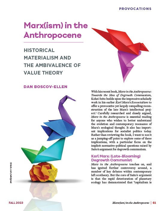
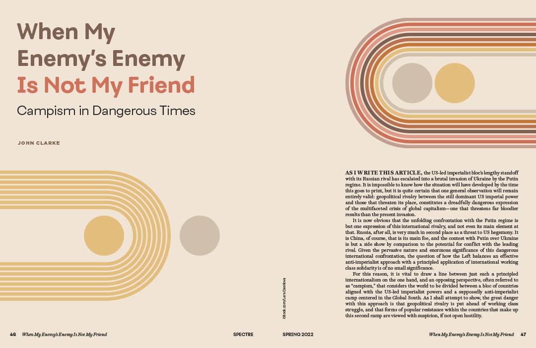
Print Issue
Gabe brought his deep background in magazine publishing to the project of Spectre’s print journal. It was critical that the layout be visual and engaging, while showing a healthy respect for the gravity of the material and staying true to the editorial intentions at each step.
First, Gabe worked with the Managing Editor and Editorial Board to select the printer — a union shop — and, from there, the paper stock for the cover and interior pages. The paper was selected to meet both quality standards and budgetary realities, as well as for feel: the final choice was one with a bit of texture, for a specific tactile quality that would highlight its differences from both magazines and academic journals.
Each issue would have its own color theme, guided by seasonality (issues come out twice a year, in the spring and the fall), any recurring themes of the issue, as well as the final choice of cover art.
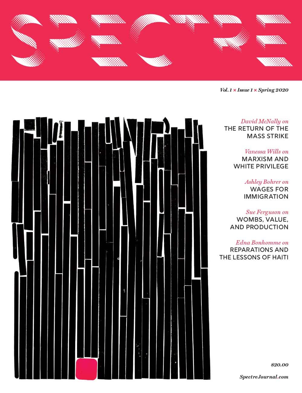
For the first issue, the color selected was, of course, red — but rather than the classic “left red,” it was pushed toward the magenta side of the spectrum: echoing the guiding principle of acknowledging history while looking toward the future.
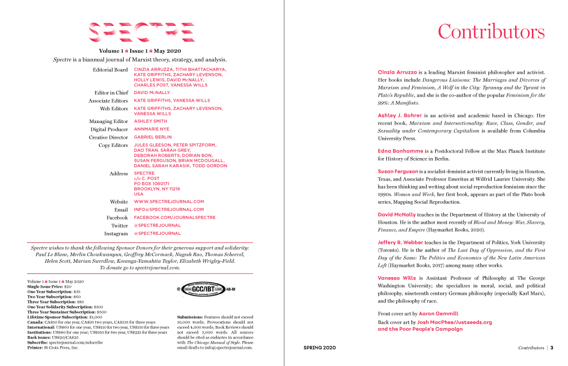
Masthead
Contributors
Throughout the layouts, the priority is legibility and accessibility, making things both easy and enjoyable to read. To that end, contrast is evaluated for every article and spread, and the body text is a point size larger than one might conventionally use.
Sample Spreads and Pages
Gabe continues to be the Creative Director of Spectre and the Art Director for every issue.
Website & Online Presence
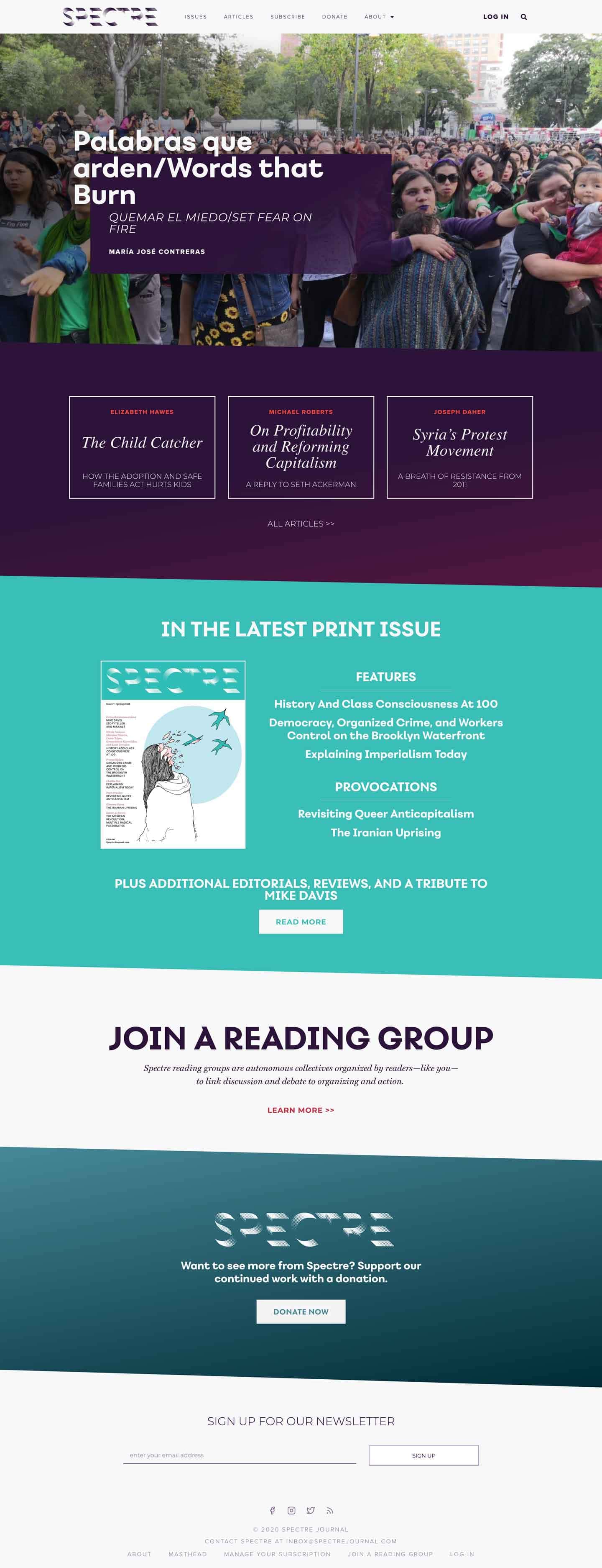
Echoing the priorities of the print issue, the site is intended to be accessible, easy to navigate, and pleasant to read on all devices. It was also conceived to be flexible, with reusable and extensible sections. Since launch, the templates have been updated and customized regularly to accommodate new priorities and updates, while still retaining the same character.
Home – Desktop
Mobile

In addition to the overall design, Fishbulb was also responsible for the build.
There were a handful of technical requirements, the most critical of which was a flexible paywall. The site encompasses both a free-to-all set of online articles, as well as subscriber-only access to the digital version of the print issues. But the editors wanted to be able to make print articles available outside the paywall on a case-by case basis.
All subscriber info is maintained by the journal’s distributor, Fulco, necessitating the creation of a custom plugin that would check against their API to authenticate subscribers, but which would allow for flagging exceptions as needed.
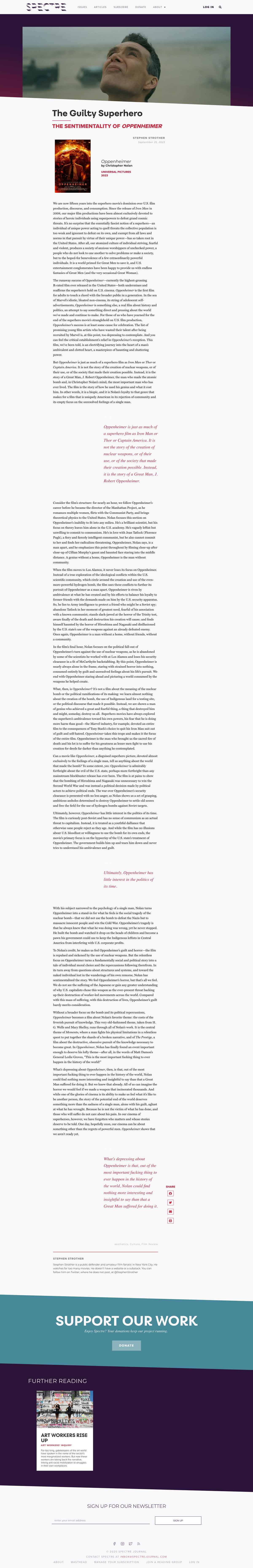
Article – Desktop
Mobile

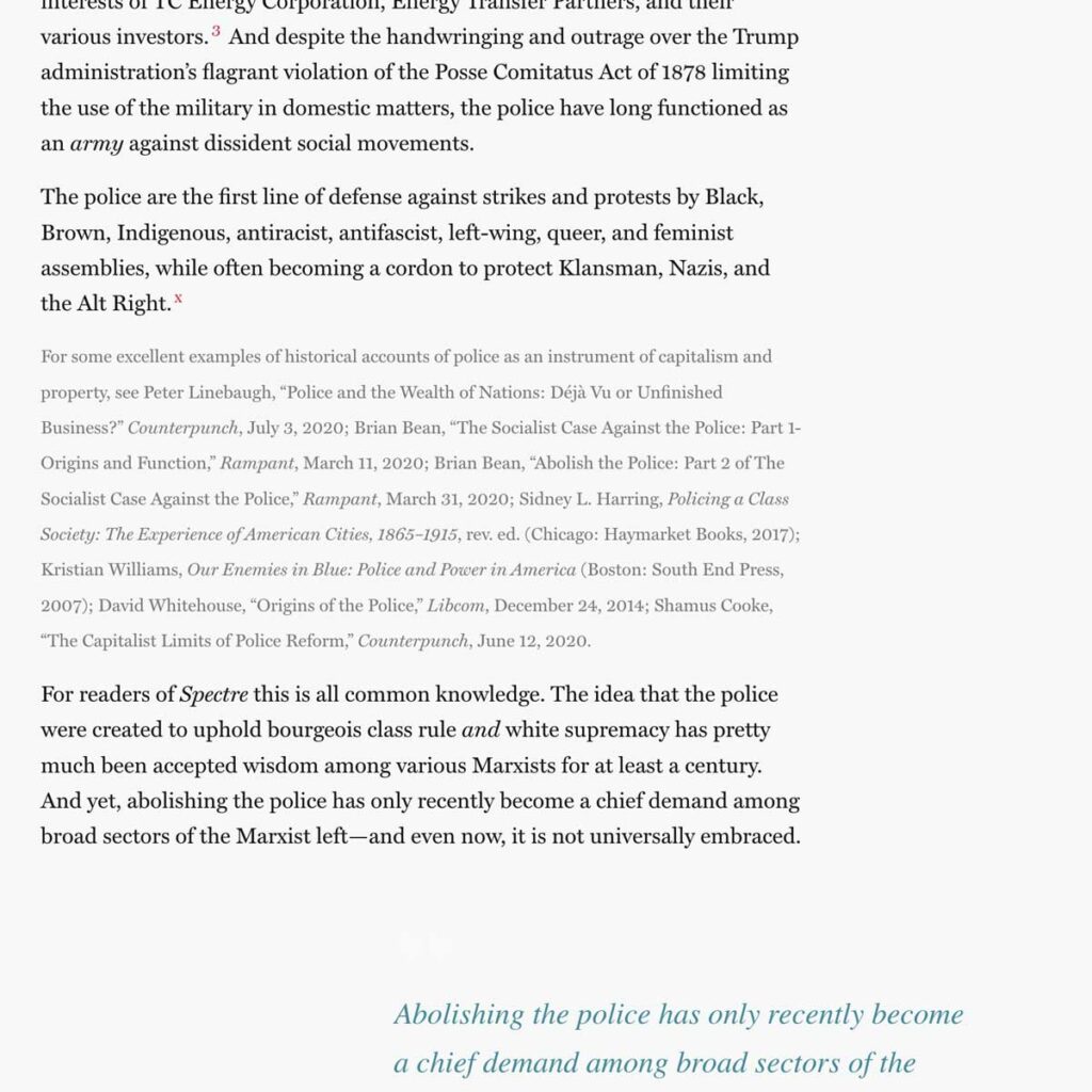
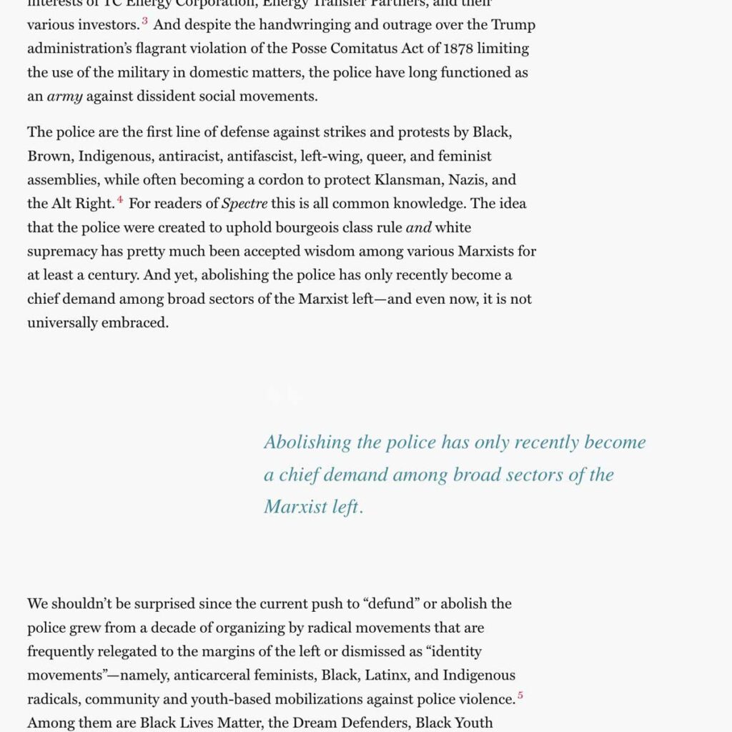
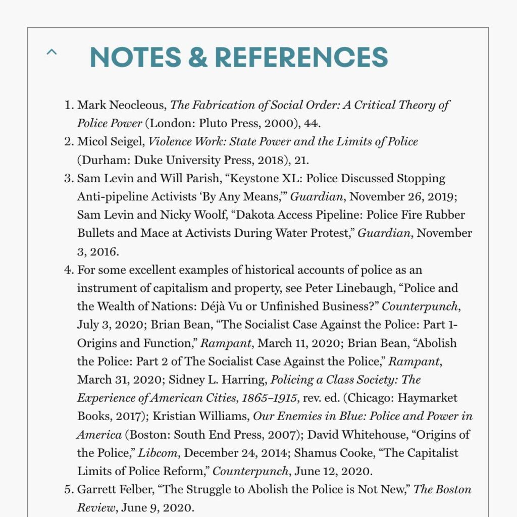
One of the interesting UX challenges was ensuring that endnotes were easy to read and navigate. Many of the articles — particularly in the online version of the print journal — are quite long, and especially on mobile, it would be a terrible experience to jump up and down the page to reference them. To solve for this, we decided on a two-tiered system.
First, endnotes are inserted contextually, and can be expanded in-line. But to ensure that the full set is also available, the bibliography is appended to the end of the article (again, with the option to hide and expand the list to reduce unnecessary scrolling, especially on mobile devices).
On the back end, it was also critical that the site be easy-to-use by the web editors and any contributors, so it is organized with custom fields and templates to facilitate automatic application of styles, without requiring a lot of fiddly formatting by the Spectre team.
Annmarie continues to act as the Digital Producer for Spectre, including running point on the digital launch of each new issue.
We’re incredibly proud to be part of Spectre. It has some of the most interesting, challenging, and informative thought and writing on the left today. We strongly recommend giving it a read.